There are a few kinds of fake places in movies. There’s the wholly fictional: Avatar’s Pandora, The Lord of the Rings’ Middle-earth. There’s the future-real: The Hunger Games’ Panem, The Handmaid’s Tale’s Gilead. And then there’s the nearly-real: The Princess Diaries’ Genovia, Batman’s Gotham, Coming to America’s Zamunda. This last category is my favorite: the places fictionalized just enough to allow for creative liberties while still being recognizable to a broad American audience with a loose grasp on world geography.
I got concerningly “into flags” some time in the spring of 2023. Since Deeper’s inception in 2022, I have kept this newsletter mostly focused on my single pet fascination of answering as-of-yet unasked questions of contemporary cinema. But my birthday was this week, and sometimes the best gift is the one only you can give to yourself.
And as I have learned from thousands of hours on r/vexillology: a flag is a multifold thing. How does one represent an entire people with a single, (usually) square-shaped piece of fabric? Flags, like any symbol of unity, are inherently controversial.
Scrubbing through dozens of movies last month has made it clear that not every film set has a flag nerd on hand. But a flag is a useful shorthand, with the best ones able to convey something essential about a film’s real and metaphorical landscapes. Let’s take a look at the until-now unexplored field of cinematic vexillology, as told through four iconic flags.
Genovia, The Princess Diaries Movies (Garry Marshall, 2001, 2004)
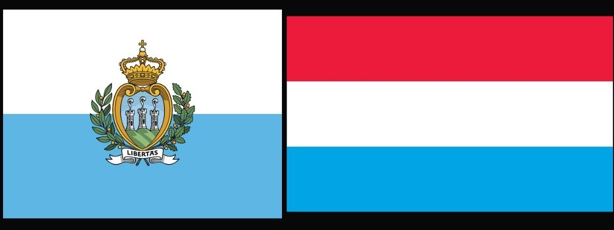
The Genovian flag is a typical European tricolor, evoking one of the earliest and best known tricolors, the flag of France. It’s unusual to see such light shades of green and blue in a flag for a European country: one might think to look towards the Caribbean for such a tropical color scheme. But the light blue also evokes San Marino and Luxembourg: wealthy microstates with picturesque castles and very small militaries. Sound familiar?
The gentle, pastel scheme reminds us of Genovia’s fantastical qualities: a monarchy with none of the icky autocratic stuff, a balmy climate and stunning landscape, and a distinctly girly sensibility. The Princess Diaries is a movie where an ordinary teen girl could be a princess, where a makeover could turn you into Anne Hathaway. The flag is likewise aspirational but it still feels slightly, hopefully, familiar.
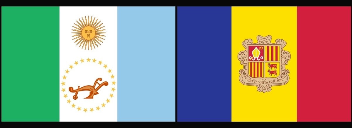
It’s the coat of arms that gives me pause. It brings to mind Andorra, yet another landlocked European principality, but the limp fleur-de-lis and interlocked rings — a motif I can’t think of outside of the Olympic flag — feel like elements pasted in MS Paint to fill space. Crests tend to feature items of significance to the country’s history, and I’m not sure why Genovia would have such an attachment to amateur monastic calligraphy.
But then, Genovia’s vagueness is part of its appeal: it is a country with no specific history, and thus no history of violence, classism, or racism. Including a specific symbol, like the plow or cows below, would raise questions about the legitimacy of the royal family that would disrupt the fantasy.
Gotham City/Gotham State, various Batman projects
There have been many Gotham Cities, but only Batman (1989) and The Dark Knight (2008) have visible flags. Batman’s Gotham is an approximation of New York, and The Dark Knight’s Gotham of Chicago — but neither flag is similar to those of their real life inspirations. New York’s borough flags are much gentler and more eclectic, and while the flag of Chicago is an all-timer, the less said about the ClipArt fantasia offered by the state flag of Illinois, the better.
I am most partial to the ‘89 flag, despite the collegiate lettering of “Gotham State.” The flag takes obvious inspiration from the (gorgeous!) Indiana state flag.
The single torch with a crown of stars is a fitting symbol for Batman, a reference to how his light illuminates Gotham’s darkness, and makes it possible for others to seek justice. The Dark Knight’s flag likewise takes cues from real flags and features plant fronds, a ship, and two silver swords. Plant life is visible on many American state flags, but the other two images get more specific to Gotham’s location.
The ship makes a case for Gotham’s position on a Great Lake — consider the flag of Pennsylvania. Underneath the ship is a year that is almost impossible to read. Hold tight, because we’re about to go way, way deeper into flags.
In an image from a fan on Reddit, the flag appears to say 1620 — and indeed, this is the date that most fan reproductions of the flag bear. But in this photo from a user on the Nikon forums, the seal on the cop car clearly says 1820. Are we meant to understand that Gotham was established in 1620, and the Gotham Police Department in 1820? The Mayflower didn’t arrive in the United States until 1620 — is Plymouth Rock in Gotham? The founding of the Gotham Police Department in 1820 would make it the oldest modern police departments in the United States, and older than the London Metropolitan Police that directly inspired modern American police departments. So where the hell is Gotham supposed to be?
I am aware that Gotham is fictional, with a smudgy history and timeline. But in these dates, I see a fundamental truth about Batman. Gotham, and Batman, have never cared about the truth: they have cared about the myth. With 1620, Gotham claims itself as the site of the founding of an empire. It reveals itself as a city that sprang from the original sin of colonial violence. And it’s the ghosts of that violence that linger in the city’s chaos.
And 1820 positions Gotham as a consequence of the Land Act of 1820. This bill sold Midwestern land inexpensively to white settlers — like the Waynes, or at least to whomever first lived in their nineteenth-century mansion. 1820 reaffirms Bruce and Batman to not just the city’s present and future, but its past, and again ties Gotham to colonial violence. So all of you who think these movies are just about a white billionaire who beats up the mentally ill for sport, look closer. They’re actually a subtle comment on the legacy of colonialism (citation needed).
The swords are a bit unusual: it’s certainly no rarity to see weaponry on American flags, but when swords appear they tend to be more literal, less decorative. This pair feels like a coat of arms, something slightly more medieval, another nod to Gotham’s violent, dark age, as well as to Batman’s taste for strict moral codes and anything generally old-fashioned.
Barbieland, Barbie (Greta Gerwig, 2023)
Do you guys remember when we had a culture war about Barbie?
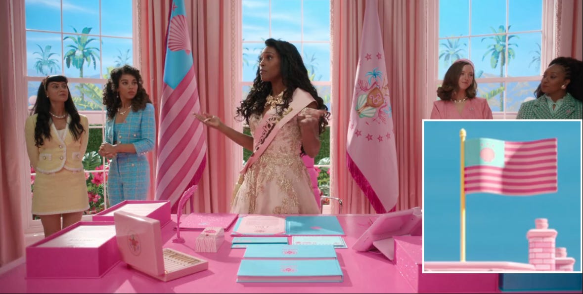
Mattel might be an American company, but the US flag is not the only flag to bear a canton (flag word for the upper left square) and stripes. Obviously, Barbieland’s flag had to be Barbie Pink, and without getting mired in the “SUMMER OF GIRL” Substack industrial complex, I want to note that pink basically does not appear on national flags. There’s really only one well-known flag that features this color scheme. If conservative pundits knew anything about flags, they would have been soooo mad.
The pastel shades remind me of Genovia, and because Barbieland is even more female, even more utopian, the flag is, of course, even dreamier. While there are real life flags with shells, the only flag I could find that features them so prominently is the whimsical flag of the English county of Bedfordshire. Barbieland’s flag also feels spiritually similar to the flag of the Netherlands province of Friesland — the heart-shaped symbols are, in fact, water lilies.
If I could offer one suggestion, I wish they had gone with squiggly lines, like those in the flags of Bedfordshire or Kiribati (a personal favorite). The wavy lines would not only be appropriately chic, plastic, and oceanic — they also would have nodded towards the movie’s messaging about discarding both the literal and metaphorical rigid boxes we’re expected to remain in. But of course, Barbieland is ultimately not where Barbie finds her liberation. She has to leave the doll set, and its fittingly knock-off flag, to get what she wants.
Halfway through the movie, the Barbieland flag is replaced with Ken’s horse patriarchy flag. You might think this is just a nonsense joke flag — but it actually does remind me of one of the absolute worst national flags. Consider the flag of the United States Virgin Islands, adopted after Denmark sold the territory to the United States. Fitting, since the Kens’ takeover was also a land grab by a militant government who didn’t know what they were doing.
I’m neutral on the Barbieland seal, because while I like that it riffs on the standard blue state stamp, it also looks like the (glorious) seal of the Bahamas filtered through an unfortunate 2005 3D computer game. I suppose the giant Barbie B is a touch more suitable here than the G of the Genovia seal. It does resemble something a kid would design with whatever stencil and sticker set came with their doll. But mostly it just reminds me that this movie was a 114 minute commercial that had grown adults crying into their front-facing cameras.


Happy belated birthday Celia!! I would like you to rate the Sicilian flag
This is the best newsletter ive ever read